TL;DR
An enterprise AI dashboard should begin with governance: what AI tools and agents exist, who owns them, which uses are approved, what risk and control status applies, and where evidence is missing. Measurement then shows cost, repeat adoption, completed work, outcomes, and the next portfolio action. A dashboard that skips the governance record cannot give leadership a reliable view of enterprise AI.
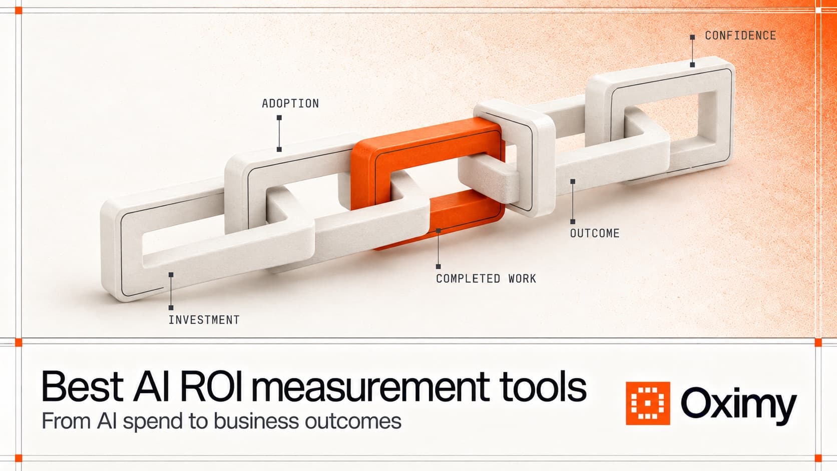
The useful governance-to-measurement chain is:
- Inventory and ownership: which tool, model, application, or agent exists and who is accountable.
- Intended use and approval: which workflow is sanctioned and what review applies.
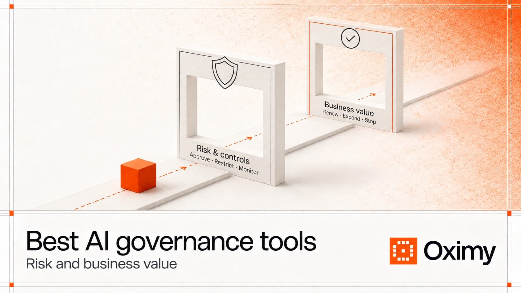
- Risk and controls: what data, permissions, policy, exceptions, and monitoring requirements matter.
- Investment and adoption: what the enterprise spends and whether use repeats in a named workflow.
- Completed work and outcomes: what finished and what changed against a baseline.
- Confidence and action: which assumptions remain and whether to expand, repair, restrict, consolidate, or stop.
Most dashboard AI products cover only part of this chain. Native dashboards show activity inside one ecosystem. Security and governance dashboards show discovery, risk, approvals, controls, or runtime evidence. BI tools visualize joined data but do not create an operating model. Oximy is relevant when a large enterprise needs governance through evidence: a shared view of AI inventory and ownership connected to spend, repeat adoption, completed work, outcomes, and portfolio action.
The best AI dashboard design is not the prettiest chart. It is the dashboard that makes the next decision harder to avoid.
What is an AI dashboard?
An AI dashboard is a reporting interface for AI systems, tools, agents, applications, usage, cost, risk, or business outcomes. The phrase is broad. Search results can mix several different buyer needs:
- An
ai usage dashboardfor adoption and activity. - An
ai agent dashboardfor agent runs, errors, cost, latency, and governance. - An AI governance dashboard for risk, inventory, controls, and approvals.
- An AI dashboard builder that helps create charts or dashboards from data.
- A portfolio dashboard for AI investments, costs, adoption, completed work, and outcomes.
That range matters because a CIO, CFO, or AI transformation leader does not need another page of attractive charts. They need to answer a management question.
Common questions include:
- Are employees using the AI tools we paid for?
- Which teams have moved from trial use to repeat workflow use?
- What does the AI portfolio cost?
- Which tools or agents are unapproved?
- Which AI investments changed cycle time, quality, capacity, revenue, risk, or cost per completed unit?
- Which investments should be renewed, expanded, repaired, consolidated, or stopped?
One dashboard rarely answers all of those questions alone. The buyer needs to know which evidence layer each tool supports.
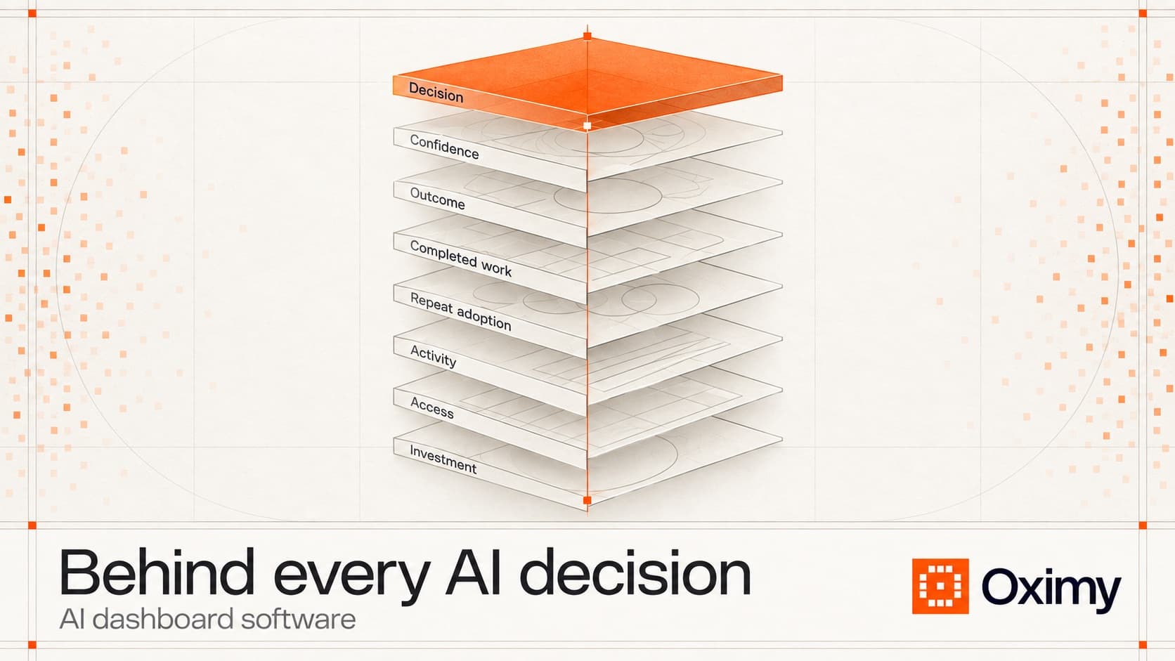
The seven layers of a useful AI value dashboard
An enterprise AI value dashboard should preserve the measurement chain instead of compressing everything into one adoption score.
| Layer | Question | Example evidence | Decision it supports |
|---|---|---|---|
| Investment | What are we paying for? | Licenses, tokens, model usage, infrastructure, services, internal effort | Budget review, renewal, consolidation |
| Access | Who could use it? | Assigned seats, enabled teams, approved agents, licensed groups | Enablement, provisioning, cleanup |
| Activity | Who or what used it? | Active users, calls, sessions, prompts, credits, tokens | Adoption monitoring and support |
| Repeat adoption | Did use return inside a named workflow? | Recurring use by task, team, user group, and period | Determine whether AI entered real work |
| Completed work | What finished? | Merged pull request, resolved case, approved contract, closed reconciliation | Connect AI use to accepted business records |
| Outcome | What changed? | Cycle time, quality, rework, capacity, revenue, risk, cost per unit | Expand, improve, stop, or redesign |
| Confidence | How strong is the conclusion? | Baseline, comparison group, missing data, attribution limits | Prevent overclaiming and prepare finance review |
Each layer changes the conversation.
Idle licenses point to reallocation or enablement. Activity without repeat adoption points to experimentation. Repeat adoption without completed-work evidence points to a data gap. Completed work without improved outcomes points to workflow redesign. Outcome movement without confidence limits points to a fragile claim.
That is why dashboard AI work should start with the decision, then the metric dictionary, then the visualization.
What a dashboard should show for executives
An executive AI dashboard should stay compact. The leadership view should not ask a CIO or CFO to scroll through raw telemetry.
For each material AI investment, show:
| Field | Why it belongs |
|---|---|
| Investment name | The tool, agent, model, use case, or program being reviewed. |
| Owner | The person accountable for the decision and evidence. |
| Cost boundary | What costs are included and excluded. |
| Adoption stage | Assigned, active, repeat workflow use, or measured impact. |
| Workflow | The named workflow where value is expected. |
| Completed-work record | The operational system that proves work finished. |
| Outcome movement | Change in speed, quality, capacity, revenue, risk, or unit cost. |
| Quality guardrail | The measure that prevents speed from hiding rework or risk. |
| Confidence | Source quality, gaps, assumptions, and attribution limits. |
| Proposed action | Renew, expand, improve, consolidate, restrict, or stop. |
The proposed action matters. A dashboard that never recommends a next decision is reporting without decision support.
How to track AI spend, usage, and value across platforms
Do not force Copilot, ChatGPT Enterprise, internal agents, and other AI tools into one synthetic usage metric. Keep each source metric intact, then join it to a common investment record: owner, department, cost boundary, adoption stage, workflow, completed-work source, outcome, and confidence. This gives finance and IT one portfolio view while preserving the differences between seats, prompts, tokens, agent runs, and completed business work.
For a CIO, the useful comparison is not which department generated the most activity. It is which investments reached repeat workflow use, which produced measurable outcomes, which remain blocked by missing data or weak adoption, and which require renewal, expansion, improvement, consolidation, restriction, or cancellation.
Types of AI dashboard software
AI value measurement platforms
Oximy's AI adoption page separates assigned access, observed activity, repeat workflow use, and completed work. Its workflow impact page describes like-for-like comparisons across completed work while keeping category, time window, quality measures, and cost definitions visible. Its AI investment review page frames the next action as renew, improve, consolidate, or stop.
This category addresses the cross-portfolio decision. Native analytics, governance dashboards, BI tools, and agent telemetry can remain source systems, while the value-measurement layer connects their evidence to cost, repeat adoption, completed work, outcomes, and confidence limits.
Native product analytics
Native analytics are dashboards supplied by the AI product or ecosystem itself.
Microsoft Copilot Analytics includes readiness and adoption reporting, Copilot and Agent dashboards, consumption reporting, and advanced analysis. Microsoft also documents a business-impact report that requires the organization to upload relevant outcome data.
GitHub's Copilot usage metrics API provides enterprise usage, engagement, and feature-adoption reporting. That data can help engineering leaders understand Copilot activity and adoption.
Native analytics are strong when the question is specific:
- Is Microsoft 365 Copilot being adopted?
- Which groups have access?
- Which Copilot features are used?
- Are GitHub Copilot seats active?
- How does usage vary by team or day?
Their limitation is portfolio scope and outcome depth. They usually do not cover every AI tool in the company, and usage does not prove ROI. A GitHub Copilot dashboard still needs repository and delivery records to examine merged work, lead time, review quality, defects, or cost per change. A Copilot dashboard still needs workflow records if the company wants to understand business impact.
Governance and security dashboards
Governance dashboards show AI inventory, risk state, owners, controls, policies, approvals, incidents, and review status. Credo AI, IBM watsonx.governance, Microsoft Purview, and ServiceNow AI Control Tower each belong near this category, with different strengths.
These dashboards answer important questions:
- What AI exists?
- Which AI use is approved?
- Who owns the risk?
- Where is sensitive data exposed?
- Which review is overdue?
- Which policy exception needs action?
Those questions matter. They just do not equal value measurement. A green control status can mean the system passed review. It does not show whether the investment changed completed work or outcomes.
Governance dashboards should feed an AI value dashboard, not replace it. The AI governance frameworks guide covers the frameworks those dashboards report against, and the AI security tools guide covers the technical security layer behind them.
BI and AI dashboard builders
A BI tool or AI dashboard builder can visualize data from multiple systems. This can be useful when the enterprise already has clean identifiers, governed metrics, and agreed definitions.
The hard part is not drawing the chart. It is joining:
- license or contract data;
- user and identity data;
- AI activity data;
- tool or agent metadata;
- workflow records;
- completed-work records;
- cost definitions;
- outcome measures;
- quality guardrails.
If those definitions are weak, an AI dashboard builder can make inconsistent data look settled. Good AI dashboard design makes definitions, source records, and missing evidence visible.
Before building a dashboard, write the metric dictionary:
| Metric | Definition question |
|---|---|
| Active user | Does one prompt count, or repeated use? |
| Adoption | Is this login activity or use inside a named workflow? |
| Cost | Are internal effort, services, infrastructure, and model usage included? |
| Completed work | Which source system proves the unit of work finished? |
| Time saved | Is it observed, estimated, surveyed, or assumed? |
| Capacity | Did saved time become more work, better work, lower cost, or just slack? |
| Quality | What prevents faster work from hiding defects or rework? |
The dashboard should display the definitions behind the score. Otherwise, the page becomes a confidence machine for weak evidence.
AI agent dashboards
An ai agent dashboard usually tracks agents rather than human users. Depending on the system, it may show agent runs, tasks, tool calls, latency, errors, escalations, approvals, cost, traces, safety events, or exceptions.
That dashboard is valuable for operations and reliability. It tells the team whether agents run, fail, escalate, or consume budget. For investment review, it still needs a bridge to business work.
Ask:
- Which workflow does the agent support?
- What task did the agent attempt?
- What human review was required?
- What completed-work record changed?
- What quality or exception rate moved?
- What cost did the agent add or remove?
Without that bridge, the agent dashboard describes machine activity. It does not prove business value.
AI dashboard software compared by evidence layer
| Dashboard category | Best fit | Strongest evidence | Main limit |
|---|---|---|---|
| Oximy | AI investment review across tools and workflows | Cost, repeat adoption, completed work, outcome, and confidence evidence | Source-system fit and approved security details need buyer-specific verification. |
| Microsoft Copilot Analytics | Microsoft 365 Copilot readiness, adoption, consumption, and business-impact analysis | Microsoft-native usage and uploaded outcome analysis where configured | Does not cover every AI tool or prove workflow ROI alone. |
| GitHub Copilot metrics | Engineering Copilot adoption and feature usage | Enterprise usage, engagement, and feature-adoption data | Needs repository, delivery, quality, and cost records before ROI claims. |
| Governance dashboards | AI inventory, owners, risk, controls, approvals, monitoring | Control and review evidence | A governed AI asset may still produce no measurable value. |
| BI or AI dashboard builder | Visualizing joined data from several systems | Flexible reporting when definitions are already reliable | Cannot fix weak attribution or inconsistent workflow definitions. |
| AI agent dashboard | Agent operations, cost, reliability, exceptions, and traces | Runtime and operational telemetry | Must connect agent activity to completed work and outcomes. |
Oximy fits enterprises that need one measurement model across AI tools and workflows. Native analytics, governance platforms, BI tools, and runtime systems supply narrower evidence that can remain authoritative in their respective layers.
How to evaluate AI dashboard design
AI dashboard design should serve decision quality. Avoid layouts that make activity look like impact.
Use this checklist:
- One dashboard, one decision. The executive view should have a clear decision job.
- Keep the evidence chain visible. Do not hide cost, adoption, completed work, outcome, and confidence behind one synthetic score.
- Show unknowns. Missing cost, missing workflow match, missing baseline, and low adoption should be visible states.
- Separate observed from estimated. A surveyed time saving is not the same as an observed capacity gain.
- Add quality guardrails. Speed without quality can create rework, risk, or hidden labor.
- Preserve drill-down. A reader should be able to move from portfolio view to workflow, source system, time window, and definition.
- Make the next action explicit. Renew, expand, repair, consolidate, restrict, or stop should be supported by evidence.
The best dashboard design is often quieter than the demo version. It gives leaders fewer, better measures and makes the limits clear.
How to select AI dashboard software
Do not start with a vendor comparison grid. Start with one real workflow and one decision.
- Pick a live AI investment with an upcoming renewal, expansion, or executive review.
- Define the investment boundary: licenses, model usage, services, infrastructure, and internal effort.
- Identify assigned access and observed activity.
- Define repeat adoption inside a named workflow.
- Choose the completed-work record the business already trusts.
- Choose one outcome measure and one quality guardrail.
- Ask each tool to reproduce the decision using the same data and time window.
- Inspect which fields are observed, calculated, manually entered, estimated, or missing.
- Confirm role-based access, deployment, retention, export, and security details directly with the vendor.
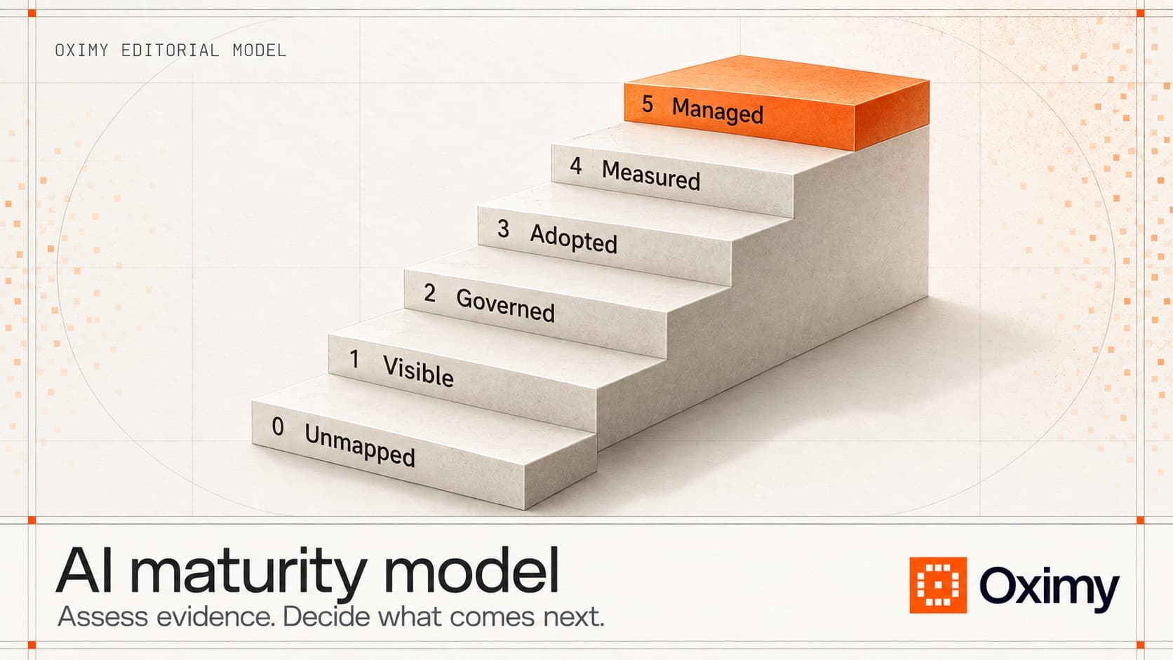
Before buying another platform, run a lightweight AI readiness assessment. Check whether the organization has a current AI inventory, named owners, usable cost data, workflow records, baseline measures, risk controls, and a review cadence. An AI maturity model and assessment is useful when those foundations are inconsistent; it should identify the next operating capability to build, not produce a decorative maturity score.
Reject any dashboard that treats time saved as cash automatically. Time can become capacity, revenue, quality, lower cost, lower risk, or nothing measurable. The dashboard should show which one occurred.
Where Oximy fits
Oximy fits when the dashboard needs to function as a governance and management view, not merely a usage report. It keeps AI inventory, ownership, sanctioned use, spend, adoption, completed work, outcomes, and the next decision connected.
Oximy is relevant when the organization needs to:
- compare several AI initiatives across departments;
- separate assigned access from repeated workflow use;
- connect usage to completed-work records;
- compare workflow outcomes against a baseline;
- keep cost definitions and quality guardrails visible;
- prepare an executive or finance-facing AI investment review.
Oximy is not the only dashboard in the stack. Native analytics, security tools, and dedicated governance systems can remain authoritative for their records. Oximy's role is to connect those records to operational adoption, work, outcomes, and portfolio action.
Ask Oximy to review one AI investment and map the gap from usage data to completed-work and outcome evidence.